Statistics and Data Handling
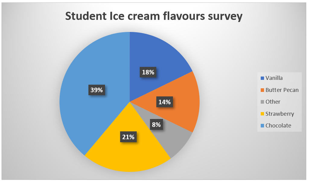
a. How many sectors are in this circle graph?
b. What percentage of students preferred chocolate ice cream?
c. What percentage of students preferred butter pecan ice cream?
d. What percentage of students didn’t prefer a particular flavour?
e. If a total of 50 people were surveyed, then how many people preferred vanilla ice cream?
If a total of 50 people were surveyed, then how many people preferred vanilla ice cream?2. Students in a class voted on their favourite fruit. Each student voted once. The bar graph below summarizes the data collected from the class vote.
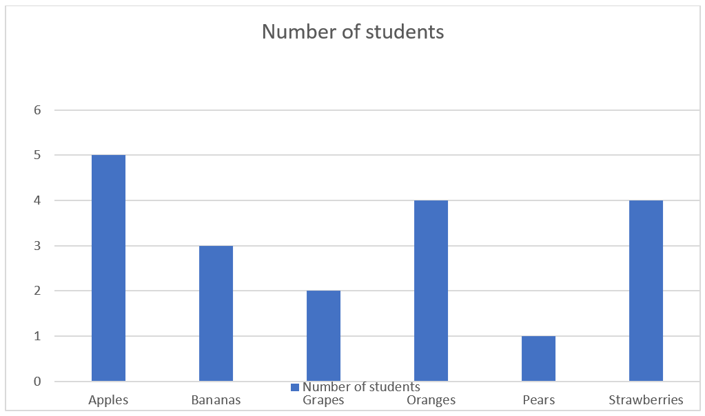
a. What is the range of values on the vertical scale?
b. How many categories are in the graph?
c. Which fruit had the most votes?
d. Which fruit has the least votes?
e. How many students voted for bananas?
f. How many students voted for grapes?
g. Which two fruits had the same number of votes?
h. List the categories of the graph from the least to the greatest.